메모
전체 예제 코드를 다운로드 하려면 여기 를 클릭 하십시오.
색상 목록에서 색상표 만들기 #
컬러 맵 생성 및 조작에 대한 자세한 내용 은 Matplotlib에서 컬러맵 생성을 참조하십시오 .
색상 목록에서 색상표를 만드는 방법은 이 LinearSegmentedColormap.from_list메서드를 사용하여 수행할 수 있습니다. 0에서 1까지의 색상 혼합을 정의하는 RGB 튜플 목록을 전달해야 합니다.
커스텀 컬러맵 만들기 #
컬러맵에 대한 사용자 지정 매핑을 생성하는 것도 가능합니다. 이것은 RGB 채널이 cmap의 한쪽 끝에서 다른 쪽 끝으로 변경되는 방식을 지정하는 사전을 생성하여 수행됩니다.
예: 아래쪽 절반에서 빨간색이 0에서 1로 증가하고 녹색이 중간 절반에서 동일하게 수행되고 파란색이 위쪽 절반에서 증가하기를 원한다고 가정합니다. 그런 다음 다음을 사용합니다.
cdict = {
    'red': (
        (0.0,  0.0, 0.0),
        (0.5,  1.0, 1.0),
        (1.0,  1.0, 1.0),
    ),
    'green': (
        (0.0,  0.0, 0.0),
        (0.25, 0.0, 0.0),
        (0.75, 1.0, 1.0),
        (1.0,  1.0, 1.0),
    ),
    'blue': (
        (0.0,  0.0, 0.0),
        (0.5,  0.0, 0.0),
        (1.0,  1.0, 1.0),
    )
}
이 예에서와 같이 r, g 및 b 구성 요소에 불연속성이 없으면 매우 간단합니다. 위의 각 튜플의 두 번째 및 세 번째 요소는 동일합니다. " y"라고 합니다. 첫 번째 요소(" x")는 0에서 1까지의 전체 범위에 대한 보간 간격을 정의하며 해당 전체 범위에 걸쳐 있어야 합니다. 즉, 값은 x0-1 범위를 세그먼트 집합으로 나누고 y각 세그먼트에 대한 끝점 색상 값을 제공합니다.
이제 녹색을 고려하십시오 cdict['green'].
0 <=
x<= 0.25,y0; 녹색이 없습니다.0.25 <
x<= 0.75,y0에서 1까지 선형적으로 변화합니다.0.75 <
x<= 1, 1로y유지, 전체 녹색.
불연속성이 있는 경우 조금 더 복잡합니다. cdict주어진 색상에 대한 항목의 각 행에 있는 3개의 요소에 로 레이블 을 지정합니다 . 그런 다음 및 사이의 값에 대해 색상 값이 및 사이에 보간 됩니다.(x, y0,
y1)xx[i]x[i+1]y1[i]y0[i+1]
요리책 예제로 돌아가서:
cdict = {
    'red': (
        (0.0,  0.0, 0.0),
        (0.5,  1.0, 0.7),
        (1.0,  1.0, 1.0),
    ),
    'green': (
        (0.0,  0.0, 0.0),
        (0.5,  1.0, 0.0),
        (1.0,  1.0, 1.0),
    ),
    'blue': (
        (0.0,  0.0, 0.0),
        (0.5,  0.0, 0.0),
        (1.0,  1.0, 1.0),
    )
}
그리고 봐라 cdict['red'][1]; 왜냐하면 0 에서
0.5까지 빨간색은 0에서 1로 증가하지만 0.5에서 1로 빨간색은 0.7에서 1로 증가하기 때문입니다. 녹색은 0에서 1로 가면서 0에서 1로 램프합니다. 0.5로, 다시 0으로 점프하고
0.5에서 1로 가면서 다시 1로 램프합니다.y0 != y1xxxx
x위는 까지의 범위 x[i]에서 x[i+1]보간이 와 사이 y1[i]에 있음을 보여주려는 시도 y0[i+1]입니다. 따라서 절대 사용하지 않습니다 y0[0].
y1[-1]
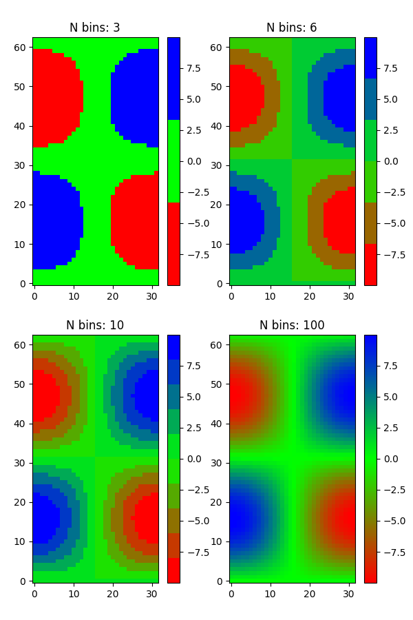
목록의 컬러맵 #
colors = [(1, 0, 0), (0, 1, 0), (0, 0, 1)]  # R -> G -> B
n_bins = [3, 6, 10, 100]  # Discretizes the interpolation into bins
cmap_name = 'my_list'
fig, axs = plt.subplots(2, 2, figsize=(6, 9))
fig.subplots_adjust(left=0.02, bottom=0.06, right=0.95, top=0.94, wspace=0.05)
for n_bin, ax in zip(n_bins, axs.flat):
    # Create the colormap
    cmap = LinearSegmentedColormap.from_list(cmap_name, colors, N=n_bin)
    # Fewer bins will result in "coarser" colomap interpolation
    im = ax.imshow(Z, origin='lower', cmap=cmap)
    ax.set_title("N bins: %s" % n_bin)
    fig.colorbar(im, ax=ax)
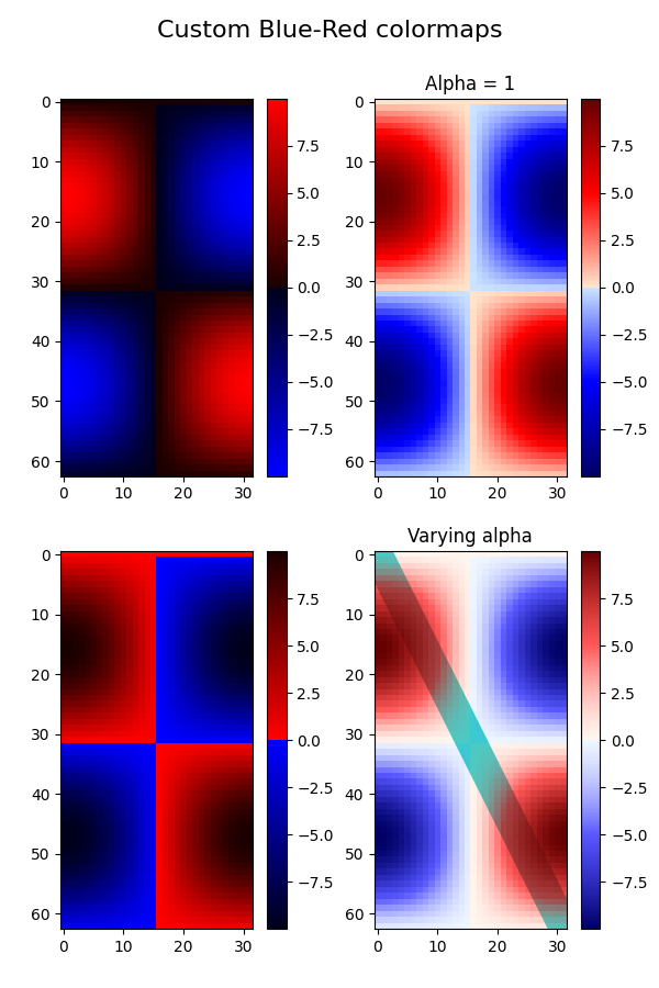
커스텀 컬러맵 #
cdict1 = {
    'red': (
        (0.0, 0.0, 0.0),
        (0.5, 0.0, 0.1),
        (1.0, 1.0, 1.0),
    ),
    'green': (
        (0.0, 0.0, 0.0),
        (1.0, 0.0, 0.0),
    ),
    'blue': (
        (0.0, 0.0, 1.0),
        (0.5, 0.1, 0.0),
        (1.0, 0.0, 0.0),
    )
}

cdict2 = {
    'red': (
        (0.0, 0.0, 0.0),
        (0.5, 0.0, 1.0),
        (1.0, 0.1, 1.0),
    ),
    'green': (
        (0.0, 0.0, 0.0),
        (1.0, 0.0, 0.0),
    ),
    'blue': (
        (0.0, 0.0, 0.1),
        (0.5, 1.0, 0.0),
        (1.0, 0.0, 0.0),
    )
}

cdict3 = {
    'red': (
        (0.0, 0.0, 0.0),
        (0.25, 0.0, 0.0),
        (0.5, 0.8, 1.0),
        (0.75, 1.0, 1.0),
        (1.0, 0.4, 1.0),
    ),
    'green': (
        (0.0, 0.0, 0.0),
        (0.25, 0.0, 0.0),
        (0.5, 0.9, 0.9),
        (0.75, 0.0, 0.0),
        (1.0, 0.0, 0.0),
    ),
    'blue': (
        (0.0, 0.0, 0.4),
        (0.25, 1.0, 1.0),
        (0.5, 1.0, 0.8),
        (0.75, 0.0, 0.0),
        (1.0, 0.0, 0.0),
    )
}

# Make a modified version of cdict3 with some transparency
# in the middle of the range.
cdict4 = {
    **cdict3,
    'alpha': (
        (0.0, 1.0, 1.0),
        # (0.25, 1.0, 1.0),
        (0.5, 0.3, 0.3),
        # (0.75, 1.0, 1.0),
        (1.0, 1.0, 1.0),
    ),
}
이제 이 예제를 사용하여 사용자 지정 컬러맵을 처리하는 두 가지 방법을 설명합니다. 첫째, 가장 직접적이고 명시적입니다.
blue_red1 = LinearSegmentedColormap('BlueRed1', cdict1)
둘째, 맵을 명시적으로 생성하고 등록합니다. 첫 번째 방법과 마찬가지로 이 방법은 LinearSegmentedColormap뿐만 아니라 모든 종류의 Colormap에서 작동합니다.
mpl.colormaps.register(LinearSegmentedColormap('BlueRed2', cdict2))
mpl.colormaps.register(LinearSegmentedColormap('BlueRed3', cdict3))
mpl.colormaps.register(LinearSegmentedColormap('BlueRedAlpha', cdict4))
4개의 서브플롯으로 그림을 만듭니다.
fig, axs = plt.subplots(2, 2, figsize=(6, 9))
fig.subplots_adjust(left=0.02, bottom=0.06, right=0.95, top=0.94, wspace=0.05)

im1 = axs[0, 0].imshow(Z, cmap=blue_red1)
fig.colorbar(im1, ax=axs[0, 0])

im2 = axs[1, 0].imshow(Z, cmap='BlueRed2')
fig.colorbar(im2, ax=axs[1, 0])

# Now we will set the third cmap as the default.  One would
# not normally do this in the middle of a script like this;
# it is done here just to illustrate the method.

plt.rcParams['image.cmap'] = 'BlueRed3'

im3 = axs[0, 1].imshow(Z)
fig.colorbar(im3, ax=axs[0, 1])
axs[0, 1].set_title("Alpha = 1")

# Or as yet another variation, we can replace the rcParams
# specification *before* the imshow with the following *after*
# imshow.
# This sets the new default *and* sets the colormap of the last
# image-like item plotted via pyplot, if any.
#

# Draw a line with low zorder so it will be behind the image.
axs[1, 1].plot([0, 10 * np.pi], [0, 20 * np.pi], color='c', lw=20, zorder=-1)

im4 = axs[1, 1].imshow(Z)
fig.colorbar(im4, ax=axs[1, 1])

# Here it is: changing the colormap for the current image and its
# colorbar after they have been plotted.
im4.set_cmap('BlueRedAlpha')
axs[1, 1].set_title("Varying alpha")

fig.suptitle('Custom Blue-Red colormaps', fontsize=16)
fig.subplots_adjust(top=0.9)

plt.show()
참조
다음 함수, 메서드, 클래스 및 모듈의 사용이 이 예제에 표시됩니다.
스크립트의 총 실행 시간: ( 0분 1.919초)