메모
전체 예제 코드를 다운로드 하려면 여기 를 클릭 하십시오.
2D 이미지의 색상과 투명도 혼합 #
투명도와 색상을 혼합하여 imshow를 사용하여 데이터의 일부를 강조 표시합니다.
의 일반적인 용도 matplotlib.pyplot.imshow는 2D 통계 맵을 그리는 것입니다. 이 기능을 사용하면 2D 매트릭스를 이미지로 쉽게 시각화하고 출력에 투명도를 추가할 수 있습니다. 예를 들어 통계(예: t-통계)를 플로팅하고 p-값에 따라 각 픽셀의 투명도에 색상을 지정할 수 있습니다. 이 예는 이 효과를 얻을 수 있는 방법을 보여줍니다.
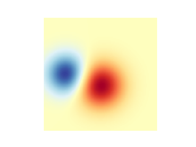
먼저 일부 데이터를 생성합니다. 이 경우에는 2D 그리드에 두 개의 2D "블롭"을 생성합니다. 하나의 얼룩은 양수이고 다른 하나는 음수입니다.
import numpy as np
import matplotlib.pyplot as plt
from matplotlib.colors import Normalize


def normal_pdf(x, mean, var):
    return np.exp(-(x - mean)**2 / (2*var))


# Generate the space in which the blobs will live
xmin, xmax, ymin, ymax = (0, 100, 0, 100)
n_bins = 100
xx = np.linspace(xmin, xmax, n_bins)
yy = np.linspace(ymin, ymax, n_bins)

# Generate the blobs. The range of the values is roughly -.0002 to .0002
means_high = [20, 50]
means_low = [50, 60]
var = [150, 200]

gauss_x_high = normal_pdf(xx, means_high[0], var[0])
gauss_y_high = normal_pdf(yy, means_high[1], var[0])

gauss_x_low = normal_pdf(xx, means_low[0], var[1])
gauss_y_low = normal_pdf(yy, means_low[1], var[1])

weights = (np.outer(gauss_y_high, gauss_x_high)
           - np.outer(gauss_y_low, gauss_x_low))

# We'll also create a grey background into which the pixels will fade
greys = np.full((*weights.shape, 3), 70, dtype=np.uint8)

# First we'll plot these blobs using ``imshow`` without transparency.
vmax = np.abs(weights).max()
imshow_kwargs = {
    'vmax': vmax,
    'vmin': -vmax,
    'cmap': 'RdYlBu',
    'extent': (xmin, xmax, ymin, ymax),
}

fig, ax = plt.subplots()
ax.imshow(greys)
ax.imshow(weights, **imshow_kwargs)
ax.set_axis_off()
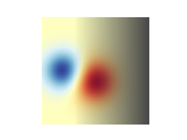
투명도 혼합 #
데이터를 플로팅할 때 투명도를 포함하는 가장 간단한 방법은
matplotlib.pyplot.imshow데이터 모양과 일치하는 배열을 alpha인수에 전달하는 것입니다. 예를 들어 아래에서 왼쪽에서 오른쪽으로 이동하는 그래디언트를 만듭니다.
# Create an alpha channel of linearly increasing values moving to the right.
alphas = np.ones(weights.shape)
alphas[:, 30:] = np.linspace(1, 0, 70)

# Create the figure and image
# Note that the absolute values may be slightly different
fig, ax = plt.subplots()
ax.imshow(greys)
ax.imshow(weights, alpha=alphas, **imshow_kwargs)
ax.set_axis_off()
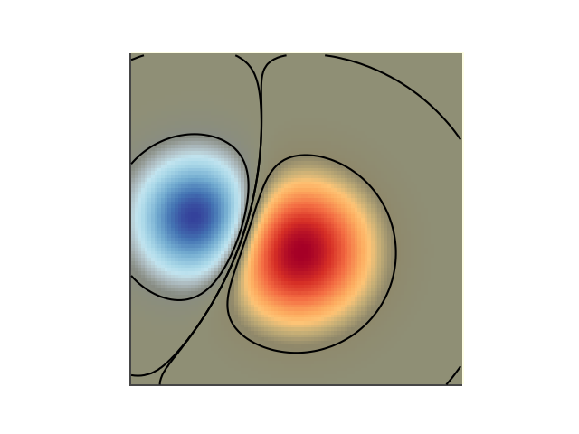
진폭이 높은 값을 강조 표시하기 위해 투명도 사용 #
마지막으로 동일한 플롯을 다시 생성하지만 이번에는 투명도를 사용하여 데이터의 극단값을 강조 표시합니다. 이는 종종 p-값이 더 작은 데이터 포인트를 강조 표시하는 데 사용됩니다. 또한 윤곽선을 추가하여 이미지 값을 강조 표시합니다.
# Create an alpha channel based on weight values
# Any value whose absolute value is > .0001 will have zero transparency
alphas = Normalize(0, .3, clip=True)(np.abs(weights))
alphas = np.clip(alphas, .4, 1)  # alpha value clipped at the bottom at .4

# Create the figure and image
# Note that the absolute values may be slightly different
fig, ax = plt.subplots()
ax.imshow(greys)
ax.imshow(weights, alpha=alphas, **imshow_kwargs)

# Add contour lines to further highlight different levels.
ax.contour(weights[::-1], levels=[-.1, .1], colors='k', linestyles='-')
ax.set_axis_off()
plt.show()

ax.contour(weights[::-1], levels=[-.0001, .0001], colors='k', linestyles='-')
ax.set_axis_off()
plt.show()
참조
다음 함수, 메서드, 클래스 및 모듈의 사용이 이 예제에 표시됩니다.