메모
전체 예제 코드를 다운로드 하려면 여기 를 클릭 하십시오.
2차원 데이터 세트의 신뢰 타원을 플로팅합니다 . #
이 예에서는 피어슨 상관 계수를 사용하여 2차원 데이터 세트의 신뢰 타원을 플로팅하는 방법을 보여줍니다.
올바른 지오메트리를 얻기 위해 사용되는 접근 방식은 여기에서 설명되고 증명됩니다.
https://carstenschelp.github.io/2018/09/14/Plot_Confidence_Ellipse_001.html
이 방법은 반복 고유 분해 알고리즘의 사용을 피하고 정규화된 공분산 행렬(피어슨 상관 계수 및 1로 구성됨)이 특히 다루기 쉽다는 사실을 이용합니다.
import numpy as np
import matplotlib.pyplot as plt
from matplotlib.patches import Ellipse
import matplotlib.transforms as transforms
플로팅 함수 자체 #
이 함수는 주어진 배열형 변수 x 및 y의 공분산의 신뢰 타원을 플로팅합니다. 타원은 주어진 축 객체 ax에 그려집니다.
타원의 반지름은 표준 편차의 수인 n_std로 제어할 수 있습니다. 기본값은 3으로, 이 예와 같이 데이터가 정규 분포인 경우 타원이 점의 98.9%를 둘러싸도록 합니다(1-D의 3 표준 편차는 데이터의 99.7%를 포함하며, 이는 2-D의 데이터의 98.9%입니다). 디).
def confidence_ellipse(x, y, ax, n_std=3.0, facecolor='none', **kwargs):
    """
    Create a plot of the covariance confidence ellipse of *x* and *y*.

    Parameters
    ----------
    x, y : array-like, shape (n, )
        Input data.

    ax : matplotlib.axes.Axes
        The axes object to draw the ellipse into.

    n_std : float
        The number of standard deviations to determine the ellipse's radiuses.

    **kwargs
        Forwarded to `~matplotlib.patches.Ellipse`

    Returns
    -------
    matplotlib.patches.Ellipse
    """
    if x.size != y.size:
        raise ValueError("x and y must be the same size")

    cov = np.cov(x, y)
    pearson = cov[0, 1]/np.sqrt(cov[0, 0] * cov[1, 1])
    # Using a special case to obtain the eigenvalues of this
    # two-dimensional dataset.
    ell_radius_x = np.sqrt(1 + pearson)
    ell_radius_y = np.sqrt(1 - pearson)
    ellipse = Ellipse((0, 0), width=ell_radius_x * 2, height=ell_radius_y * 2,
                      facecolor=facecolor, **kwargs)

    # Calculating the standard deviation of x from
    # the squareroot of the variance and multiplying
    # with the given number of standard deviations.
    scale_x = np.sqrt(cov[0, 0]) * n_std
    mean_x = np.mean(x)

    # calculating the standard deviation of y ...
    scale_y = np.sqrt(cov[1, 1]) * n_std
    mean_y = np.mean(y)

    transf = transforms.Affine2D() \
        .rotate_deg(45) \
        .scale(scale_x, scale_y) \
        .translate(mean_x, mean_y)

    ellipse.set_transform(transf + ax.transData)
    return ax.add_patch(ellipse)
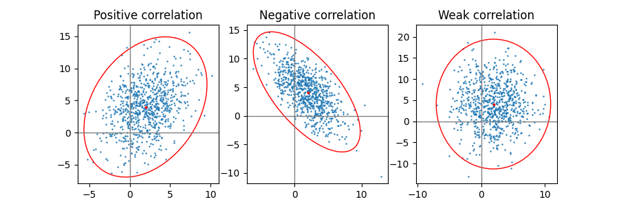
양수, 음수 및 약한 상관관계 #
약한 상관 관계(오른쪽)의 모양은 x와 y의 크기가 서로 다르기 때문에 원이 아니라 타원입니다. 그러나 x와 y가 상관관계가 없다는 사실은 타원의 축이 좌표계의 x축과 y축에 정렬되어 있음을 나타냅니다.
np.random.seed(0)

PARAMETERS = {
    'Positive correlation': [[0.85, 0.35],
                             [0.15, -0.65]],
    'Negative correlation': [[0.9, -0.4],
                             [0.1, -0.6]],
    'Weak correlation': [[1, 0],
                         [0, 1]],
}

mu = 2, 4
scale = 3, 5

fig, axs = plt.subplots(1, 3, figsize=(9, 3))
for ax, (title, dependency) in zip(axs, PARAMETERS.items()):
    x, y = get_correlated_dataset(800, dependency, mu, scale)
    ax.scatter(x, y, s=0.5)

    ax.axvline(c='grey', lw=1)
    ax.axhline(c='grey', lw=1)

    confidence_ellipse(x, y, ax, edgecolor='red')

    ax.scatter(mu[0], mu[1], c='red', s=3)
    ax.set_title(title)

plt.show()
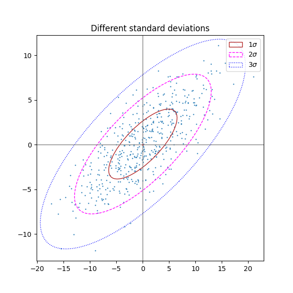
표준 편차의 다른 수 #
n_std = 3(파란색), 2(보라색) 및 1(빨간색)인 플롯
fig, ax_nstd = plt.subplots(figsize=(6, 6))

dependency_nstd = [[0.8, 0.75],
                   [-0.2, 0.35]]
mu = 0, 0
scale = 8, 5

ax_nstd.axvline(c='grey', lw=1)
ax_nstd.axhline(c='grey', lw=1)

x, y = get_correlated_dataset(500, dependency_nstd, mu, scale)
ax_nstd.scatter(x, y, s=0.5)

confidence_ellipse(x, y, ax_nstd, n_std=1,
                   label=r'$1\sigma$', edgecolor='firebrick')
confidence_ellipse(x, y, ax_nstd, n_std=2,
                   label=r'$2\sigma$', edgecolor='fuchsia', linestyle='--')
confidence_ellipse(x, y, ax_nstd, n_std=3,
                   label=r'$3\sigma$', edgecolor='blue', linestyle=':')

ax_nstd.scatter(mu[0], mu[1], c='red', s=3)
ax_nstd.set_title('Different standard deviations')
ax_nstd.legend()
plt.show()
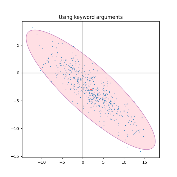
키워드 인수 사용 #
matplotlib.patches.Patch타원을 다른 방식으로 렌더링하려면 지정된 키워드 인수를 사용하십시오 .
fig, ax_kwargs = plt.subplots(figsize=(6, 6))
dependency_kwargs = [[-0.8, 0.5],
                     [-0.2, 0.5]]
mu = 2, -3
scale = 6, 5

ax_kwargs.axvline(c='grey', lw=1)
ax_kwargs.axhline(c='grey', lw=1)

x, y = get_correlated_dataset(500, dependency_kwargs, mu, scale)
# Plot the ellipse with zorder=0 in order to demonstrate
# its transparency (caused by the use of alpha).
confidence_ellipse(x, y, ax_kwargs,
                   alpha=0.5, facecolor='pink', edgecolor='purple', zorder=0)

ax_kwargs.scatter(x, y, s=0.5)
ax_kwargs.scatter(mu[0], mu[1], c='red', s=3)
ax_kwargs.set_title('Using keyword arguments')

fig.subplots_adjust(hspace=0.25)
plt.show()
스크립트의 총 실행 시간: ( 0분 1.609초)