메모
전체 예제 코드를 다운로드 하려면 여기 를 클릭 하십시오.
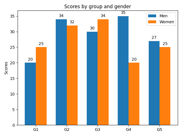
레이블이 있는 그룹화된 막대 차트 #
이 예제에서는 그룹화된 막대 차트를 만드는 방법과 레이블로 막대에 주석을 추가하는 방법을 보여줍니다.
import matplotlib.pyplot as plt
import numpy as np


labels = ['G1', 'G2', 'G3', 'G4', 'G5']
men_means = [20, 34, 30, 35, 27]
women_means = [25, 32, 34, 20, 25]

x = np.arange(len(labels))  # the label locations
width = 0.35  # the width of the bars

fig, ax = plt.subplots()
rects1 = ax.bar(x - width/2, men_means, width, label='Men')
rects2 = ax.bar(x + width/2, women_means, width, label='Women')

# Add some text for labels, title and custom x-axis tick labels, etc.
ax.set_ylabel('Scores')
ax.set_title('Scores by group and gender')
ax.set_xticks(x, labels)
ax.legend()

ax.bar_label(rects1, padding=3)
ax.bar_label(rects2, padding=3)

fig.tight_layout()

plt.show()
참조
다음 함수, 메서드, 클래스 및 모듈의 사용이 이 예제에 표시됩니다.