메모
전체 예제 코드를 다운로드 하려면 여기 를 클릭 하십시오.
수평 막대 차트로서의 백분위수 #
막대 차트는 개수를 시각화하거나 오차 막대가 있는 요약 통계에 유용합니다. 또한 이러한 기능의 더 간단한 버전에 대해서는 레이블이 있는 그룹화된 막대 차트 또는 가로 막대 차트 예제를 참조하십시오.
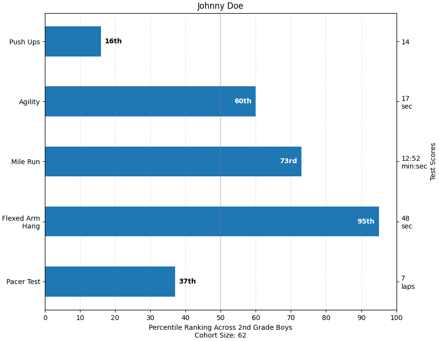
이 예는 초등학교 체육관 교사가 부모에게 자녀가 몇 가지 체력 테스트에서 어떻게 했는지, 그리고 중요하게는 다른 아이들이 어떻게 했는지를 부모에게 보여줄 수 있기를 원했던 애플리케이션에서 나온 것입니다. 데모 목적으로 플로팅 코드를 추출하기 위해 작은 Johnny Doe에 대한 데이터를 구성할 것입니다.
from collections import namedtuple
import numpy as np
import matplotlib.pyplot as plt


Student = namedtuple('Student', ['name', 'grade', 'gender'])
Score = namedtuple('Score', ['value', 'unit', 'percentile'])


def to_ordinal(num):
    """Convert an integer to an ordinal string, e.g. 2 -> '2nd'."""
    suffixes = {str(i): v
                for i, v in enumerate(['th', 'st', 'nd', 'rd', 'th',
                                       'th', 'th', 'th', 'th', 'th'])}
    v = str(num)
    # special case early teens
    if v in {'11', '12', '13'}:
        return v + 'th'
    return v + suffixes[v[-1]]


def format_score(score):
    """
    Create score labels for the right y-axis as the test name followed by the
    measurement unit (if any), split over two lines.
    """
    return f'{score.value}\n{score.unit}' if score.unit else str(score.value)


def plot_student_results(student, scores_by_test, cohort_size):
    fig, ax1 = plt.subplots(figsize=(9, 7), constrained_layout=True)
    fig.canvas.manager.set_window_title('Eldorado K-8 Fitness Chart')

    ax1.set_title(student.name)
    ax1.set_xlabel(
        'Percentile Ranking Across {grade} Grade {gender}s\n'
        'Cohort Size: {cohort_size}'.format(
            grade=to_ordinal(student.grade),
            gender=student.gender.title(),
            cohort_size=cohort_size))

    test_names = list(scores_by_test.keys())
    percentiles = [score.percentile for score in scores_by_test.values()]

    rects = ax1.barh(test_names, percentiles, align='center', height=0.5)
    # Partition the percentile values to be able to draw large numbers in
    # white within the bar, and small numbers in black outside the bar.
    large_percentiles = [to_ordinal(p) if p > 40 else '' for p in percentiles]
    small_percentiles = [to_ordinal(p) if p <= 40 else '' for p in percentiles]
    ax1.bar_label(rects, small_percentiles,
                  padding=5, color='black', fontweight='bold')
    ax1.bar_label(rects, large_percentiles,
                  padding=-32, color='white', fontweight='bold')

    ax1.set_xlim([0, 100])
    ax1.set_xticks([0, 10, 20, 30, 40, 50, 60, 70, 80, 90, 100])
    ax1.xaxis.grid(True, linestyle='--', which='major',
                   color='grey', alpha=.25)
    ax1.axvline(50, color='grey', alpha=0.25)  # median position

    # Set the right-hand Y-axis ticks and labels
    ax2 = ax1.twinx()
    # Set equal limits on both yaxis so that the ticks line up
    ax2.set_ylim(ax1.get_ylim())
    # Set the tick locations and labels
    ax2.set_yticks(
        np.arange(len(scores_by_test)),
        labels=[format_score(score) for score in scores_by_test.values()])

    ax2.set_ylabel('Test Scores')


student = Student(name='Johnny Doe', grade=2, gender='Boy')
scores_by_test = {
    'Pacer Test': Score(7, 'laps', percentile=37),
    'Flexed Arm\n Hang': Score(48, 'sec', percentile=95),
    'Mile Run': Score('12:52', 'min:sec', percentile=73),
    'Agility': Score(17, 'sec', percentile=60),
    'Push Ups': Score(14, '', percentile=16),
}

plot_student_results(student, scores_by_test, cohort_size=62)
plt.show()
참조
다음 함수, 메서드, 클래스 및 모듈의 사용이 이 예제에 표시됩니다.