메모
전체 예제 코드를 다운로드 하려면 여기 를 클릭 하십시오.
PSD 데모 #
Matplotlib에서 전력 스펙트럼 밀도(PSD)를 플로팅합니다.
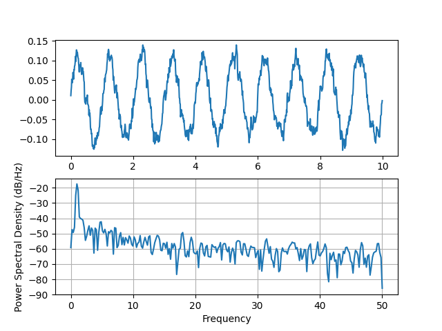
PSD는 신호 처리 분야의 일반적인 플롯입니다. NumPy에는 PSD를 계산하는 데 유용한 라이브러리가 많이 있습니다. 아래에서 Matplotlib로 이를 수행하고 시각화할 수 있는 방법에 대한 몇 가지 예를 시연합니다.
import matplotlib.pyplot as plt
import numpy as np
import matplotlib.mlab as mlab

# Fixing random state for reproducibility
np.random.seed(19680801)

dt = 0.01
t = np.arange(0, 10, dt)
nse = np.random.randn(len(t))
r = np.exp(-t / 0.05)

cnse = np.convolve(nse, r) * dt
cnse = cnse[:len(t)]
s = 0.1 * np.sin(2 * np.pi * t) + cnse

fig, (ax0, ax1) = plt.subplots(2, 1)
ax0.plot(t, s)
ax1.psd(s, 512, 1 / dt)

plt.show()
동등한 Matlab 코드와 비교하여 동일한 작업을 수행합니다.
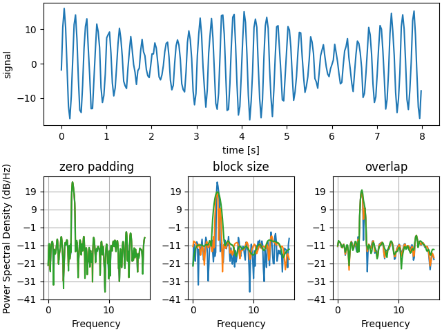
아래에서는 패딩이 결과 PSD에 미치는 영향을 보여주는 약간 더 복잡한 예를 보여줍니다.
dt = np.pi / 100.
fs = 1. / dt
t = np.arange(0, 8, dt)
y = 10. * np.sin(2 * np.pi * 4 * t) + 5. * np.sin(2 * np.pi * 4.25 * t)
y = y + np.random.randn(*t.shape)

# Plot the raw time series
fig, axs = plt.subplot_mosaic([
    ['signal', 'signal', 'signal'],
    ['zero padding', 'block size', 'overlap'],
], layout='constrained')

axs['signal'].plot(t, y)
axs['signal'].set_xlabel('time [s]')
axs['signal'].set_ylabel('signal')

# Plot the PSD with different amounts of zero padding. This uses the entire
# time series at once
axs['zero padding'].psd(y, NFFT=len(t), pad_to=len(t), Fs=fs)
axs['zero padding'].psd(y, NFFT=len(t), pad_to=len(t) * 2, Fs=fs)
axs['zero padding'].psd(y, NFFT=len(t), pad_to=len(t) * 4, Fs=fs)

# Plot the PSD with different block sizes, Zero pad to the length of the
# original data sequence.
axs['block size'].psd(y, NFFT=len(t), pad_to=len(t), Fs=fs)
axs['block size'].psd(y, NFFT=len(t) // 2, pad_to=len(t), Fs=fs)
axs['block size'].psd(y, NFFT=len(t) // 4, pad_to=len(t), Fs=fs)
axs['block size'].set_ylabel('')

# Plot the PSD with different amounts of overlap between blocks
axs['overlap'].psd(y, NFFT=len(t) // 2, pad_to=len(t), noverlap=0, Fs=fs)
axs['overlap'].psd(y, NFFT=len(t) // 2, pad_to=len(t),
                   noverlap=int(0.025 * len(t)), Fs=fs)
axs['overlap'].psd(y, NFFT=len(t) // 2, pad_to=len(t),
                   noverlap=int(0.1 * len(t)), Fs=fs)
axs['overlap'].set_ylabel('')
axs['overlap'].set_title('overlap')

for title, ax in axs.items():
    if title == 'signal':
        continue

    ax.set_title(title)
    ax.sharex(axs['zero padding'])
    ax.sharey(axs['zero padding'])

plt.show()
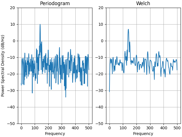
이것은 Matplotlib와 MATLAB의 PSD 스케일링 사이에 한 번에 약간의 차이를 보여주는 신호 처리 도구 상자의 MATLAB 예제의 포팅된 버전입니다.
fs = 1000
t = np.linspace(0, 0.3, 301)
A = np.array([2, 8]).reshape(-1, 1)
f = np.array([150, 140]).reshape(-1, 1)
xn = (A * np.sin(2 * np.pi * f * t)).sum(axis=0)
xn += 5 * np.random.randn(*t.shape)

fig, (ax0, ax1) = plt.subplots(ncols=2, constrained_layout=True)

yticks = np.arange(-50, 30, 10)
yrange = (yticks[0], yticks[-1])
xticks = np.arange(0, 550, 100)

ax0.psd(xn, NFFT=301, Fs=fs, window=mlab.window_none, pad_to=1024,
        scale_by_freq=True)
ax0.set_title('Periodogram')
ax0.set_yticks(yticks)
ax0.set_xticks(xticks)
ax0.grid(True)
ax0.set_ylim(yrange)

ax1.psd(xn, NFFT=150, Fs=fs, window=mlab.window_none, pad_to=512, noverlap=75,
        scale_by_freq=True)
ax1.set_title('Welch')
ax1.set_xticks(xticks)
ax1.set_yticks(yticks)
ax1.set_ylabel('')  # overwrite the y-label added by `psd`
ax1.grid(True)
ax1.set_ylim(yrange)

plt.show()
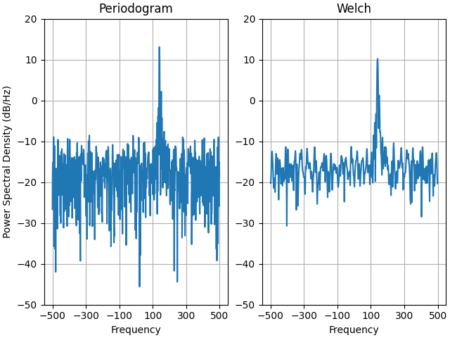
이것은 Matplotlib와 MATLAB의 PSD 스케일링 사이에 한 번에 약간의 차이를 보여주는 신호 처리 도구 상자의 MATLAB 예제의 포팅된 버전입니다.
복잡한 신호를 사용하므로 복잡한 PSD가 제대로 작동하는 것을 볼 수 있습니다.
prng = np.random.RandomState(19680801)  # to ensure reproducibility

fs = 1000
t = np.linspace(0, 0.3, 301)
A = np.array([2, 8]).reshape(-1, 1)
f = np.array([150, 140]).reshape(-1, 1)
xn = (A * np.exp(2j * np.pi * f * t)).sum(axis=0) + 5 * prng.randn(*t.shape)

fig, (ax0, ax1) = plt.subplots(ncols=2, constrained_layout=True)

yticks = np.arange(-50, 30, 10)
yrange = (yticks[0], yticks[-1])
xticks = np.arange(-500, 550, 200)

ax0.psd(xn, NFFT=301, Fs=fs, window=mlab.window_none, pad_to=1024,
        scale_by_freq=True)
ax0.set_title('Periodogram')
ax0.set_yticks(yticks)
ax0.set_xticks(xticks)
ax0.grid(True)
ax0.set_ylim(yrange)

ax1.psd(xn, NFFT=150, Fs=fs, window=mlab.window_none, pad_to=512, noverlap=75,
        scale_by_freq=True)
ax1.set_title('Welch')
ax1.set_xticks(xticks)
ax1.set_yticks(yticks)
ax1.set_ylabel('')  # overwrite the y-label added by `psd`
ax1.grid(True)
ax1.set_ylim(yrange)

plt.show()
스크립트의 총 실행 시간: (0분 3.220초)