메모
전체 예제 코드를 다운로드 하려면 여기 를 클릭 하십시오.
Pcolor 데모 #
pcolor. _
Pcolor를 사용하면 2D 이미지 스타일 플롯을 생성할 수 있습니다. 아래에서는 Matplotlib에서 이를 수행하는 방법을 보여줍니다.
import matplotlib.pyplot as plt
import numpy as np
from matplotlib.colors import LogNorm


# Fixing random state for reproducibility
np.random.seed(19680801)
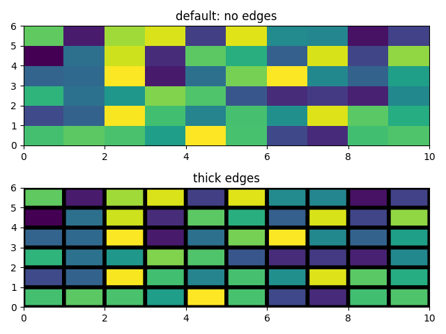
간단한 pcolor 데모 #
Z = np.random.rand(6, 10)

fig, (ax0, ax1) = plt.subplots(2, 1)

c = ax0.pcolor(Z)
ax0.set_title('default: no edges')

c = ax1.pcolor(Z, edgecolors='k', linewidths=4)
ax1.set_title('thick edges')

fig.tight_layout()
plt.show()
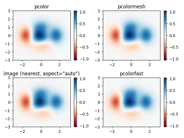
유사한 기능과 pcolor 비교 #
사변형 그리드 그리기에 대한 , pcolor및
사이
의 유사성을 보여줍니다 . 데이터 픽셀이 정사각형이 되도록 강제하지 않도록 with 를 호출 합니다(기본값은 ).pcolormeshimshowpcolorfastimshowaspect="auto"aspect="equal"
# make these smaller to increase the resolution
dx, dy = 0.15, 0.05

# generate 2 2d grids for the x & y bounds
y, x = np.mgrid[-3:3+dy:dy, -3:3+dx:dx]
z = (1 - x/2 + x**5 + y**3) * np.exp(-x**2 - y**2)
# x and y are bounds, so z should be the value *inside* those bounds.
# Therefore, remove the last value from the z array.
z = z[:-1, :-1]
z_min, z_max = -abs(z).max(), abs(z).max()

fig, axs = plt.subplots(2, 2)

ax = axs[0, 0]
c = ax.pcolor(x, y, z, cmap='RdBu', vmin=z_min, vmax=z_max)
ax.set_title('pcolor')
fig.colorbar(c, ax=ax)

ax = axs[0, 1]
c = ax.pcolormesh(x, y, z, cmap='RdBu', vmin=z_min, vmax=z_max)
ax.set_title('pcolormesh')
fig.colorbar(c, ax=ax)

ax = axs[1, 0]
c = ax.imshow(z, cmap='RdBu', vmin=z_min, vmax=z_max,
              extent=[x.min(), x.max(), y.min(), y.max()],
              interpolation='nearest', origin='lower', aspect='auto')
ax.set_title('image (nearest, aspect="auto")')
fig.colorbar(c, ax=ax)

ax = axs[1, 1]
c = ax.pcolorfast(x, y, z, cmap='RdBu', vmin=z_min, vmax=z_max)
ax.set_title('pcolorfast')
fig.colorbar(c, ax=ax)

fig.tight_layout()
plt.show()
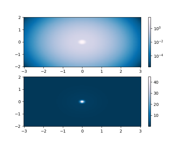
로그 스케일이 있는 Pcolor #
다음은 로그 스케일이 있는 pcolor 플롯을 보여줍니다.
N = 100
X, Y = np.meshgrid(np.linspace(-3, 3, N), np.linspace(-2, 2, N))

# A low hump with a spike coming out.
# Needs to have z/colour axis on a log scale so we see both hump and spike.
# linear scale only shows the spike.
Z1 = np.exp(-X**2 - Y**2)
Z2 = np.exp(-(X * 10)**2 - (Y * 10)**2)
Z = Z1 + 50 * Z2

fig, (ax0, ax1) = plt.subplots(2, 1)

c = ax0.pcolor(X, Y, Z, shading='auto',
               norm=LogNorm(vmin=Z.min(), vmax=Z.max()), cmap='PuBu_r')
fig.colorbar(c, ax=ax0)

c = ax1.pcolor(X, Y, Z, cmap='PuBu_r', shading='auto')
fig.colorbar(c, ax=ax1)

plt.show()
참조
다음 함수, 메서드, 클래스 및 모듈의 사용이 이 예제에 표시됩니다.
스크립트의 총 실행 시간: ( 0분 1.891초)