메모
전체 예제 코드를 다운로드 하려면 여기 를 클릭 하십시오.
사이 채우기 및 알파 #
이 fill_between함수는 범위를 설명하는 데 유용한 최소 및 최대 경계 사이의 음영 영역을 생성합니다. where예를 들어 일부 임계값 이상의 곡선을 채우기 위해 논리 범위와 채우기를 결합 하는 매우 편리한 인수가 있습니다.
가장 기본적인 수준에서 fill_between그래프의 시각적 모양을 향상시키는 데 사용할 수 있습니다. 재무 데이터의 두 그래프를 왼쪽의 간단한 선 그림과 오른쪽의 채워진 선으로 비교해 봅시다.
import matplotlib.pyplot as plt
import numpy as np
import matplotlib.cbook as cbook


# load up some sample financial data
r = (cbook.get_sample_data('goog.npz', np_load=True)['price_data']
     .view(np.recarray))
# create two subplots with the shared x and y axes
fig, (ax1, ax2) = plt.subplots(1, 2, sharex=True, sharey=True)

pricemin = r.close.min()

ax1.plot(r.date, r.close, lw=2)
ax2.fill_between(r.date, pricemin, r.close, alpha=0.7)

for ax in ax1, ax2:
    ax.grid(True)
    ax.label_outer()

ax1.set_ylabel('price')

fig.suptitle('Google (GOOG) daily closing price')
fig.autofmt_xdate()
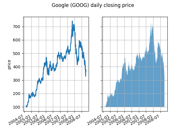
여기서 알파 채널은 필요하지 않지만 보다 시각적으로 매력적인 플롯을 위해 색상을 부드럽게 하는 데 사용할 수 있습니다. 다른 예에서는 아래에서 볼 수 있듯이 음영 처리된 영역이 겹칠 수 있고 알파를 통해 둘 다 볼 수 있으므로 알파 채널은 기능적으로 유용합니다. 포스트스크립트 형식은 알파를 지원하지 않으므로(matplotlib 제한이 아니라 포스트스크립트 제한임) 알파를 사용할 때 그림을 PNG, PDF 또는 SVG로 저장하십시오.
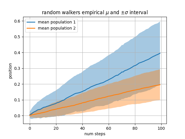
다음 예제에서는 단계가 그려지는 정규 분포의 평균과 표준 편차가 서로 다른 두 개의 랜덤 워커 모집단을 계산합니다. 채우기 영역을 사용하여 인구 평균 위치의 +/- 1 표준 편차를 플로팅합니다. 여기에서 알파 채널은 유용할 뿐만 아니라 미학적입니다.
# Fixing random state for reproducibility
np.random.seed(19680801)

Nsteps, Nwalkers = 100, 250
t = np.arange(Nsteps)

# an (Nsteps x Nwalkers) array of random walk steps
S1 = 0.004 + 0.02*np.random.randn(Nsteps, Nwalkers)
S2 = 0.002 + 0.01*np.random.randn(Nsteps, Nwalkers)

# an (Nsteps x Nwalkers) array of random walker positions
X1 = S1.cumsum(axis=0)
X2 = S2.cumsum(axis=0)


# Nsteps length arrays empirical means and standard deviations of both
# populations over time
mu1 = X1.mean(axis=1)
sigma1 = X1.std(axis=1)
mu2 = X2.mean(axis=1)
sigma2 = X2.std(axis=1)

# plot it!
fig, ax = plt.subplots(1)
ax.plot(t, mu1, lw=2, label='mean population 1')
ax.plot(t, mu2, lw=2, label='mean population 2')
ax.fill_between(t, mu1+sigma1, mu1-sigma1, facecolor='C0', alpha=0.4)
ax.fill_between(t, mu2+sigma2, mu2-sigma2, facecolor='C1', alpha=0.4)
ax.set_title(r'random walkers empirical $\mu$ and $\pm \sigma$ interval')
ax.legend(loc='upper left')
ax.set_xlabel('num steps')
ax.set_ylabel('position')
ax.grid()
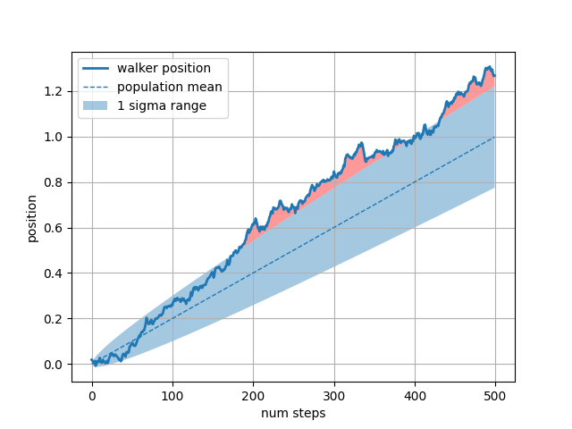
where키워드 인수는 그래프의 특정 영역을 강조 표시하는 데 매우 편리합니다 . wherex, ymin 및 ymax 인수와 동일한 길이의 부울 마스크를 사용하고 부울 마스크가 True인 영역만 채웁니다. 아래 예에서는 단일 랜덤 워커를 시뮬레이션하고 모집단 위치의 분석 평균 및 표준 편차를 계산합니다. 모집단 평균은 파선으로 표시되고 평균에서 플러스/마이너스 1 시그마 편차는 채워진 영역으로 표시됩니다. where 마스크 를 사용하여 워커가 1 시그마 경계 밖에 있는 영역을 찾고 해당 영역을 빨간색으로 음영 처리합니다.X > upper_bound
# Fixing random state for reproducibility
np.random.seed(1)

Nsteps = 500
t = np.arange(Nsteps)

mu = 0.002
sigma = 0.01

# the steps and position
S = mu + sigma*np.random.randn(Nsteps)
X = S.cumsum()

# the 1 sigma upper and lower analytic population bounds
lower_bound = mu*t - sigma*np.sqrt(t)
upper_bound = mu*t + sigma*np.sqrt(t)

fig, ax = plt.subplots(1)
ax.plot(t, X, lw=2, label='walker position')
ax.plot(t, mu*t, lw=1, label='population mean', color='C0', ls='--')
ax.fill_between(t, lower_bound, upper_bound, facecolor='C0', alpha=0.4,
                label='1 sigma range')
ax.legend(loc='upper left')

# here we use the where argument to only fill the region where the
# walker is above the population 1 sigma boundary
ax.fill_between(t, upper_bound, X, where=X > upper_bound, fc='red', alpha=0.4)
ax.fill_between(t, lower_bound, X, where=X < lower_bound, fc='red', alpha=0.4)
ax.set_xlabel('num steps')
ax.set_ylabel('position')
ax.grid()
채워진 영역을 편리하게 사용하는 또 다른 방법은 Axes의 가로 또는 세로 범위를 강조 표시하는 것
axhspan입니다 axvspan. axhspan 데모 를 참조하십시오
.
plt.show()
스크립트의 총 실행 시간: ( 0분 1.566초)