메모
전체 예제 코드를 다운로드 하려면 여기 를 클릭 하십시오.
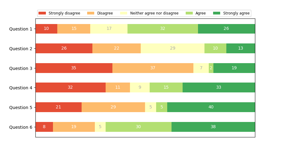
수평 막대 차트의 이산 분포 #
누적 막대 차트를 사용하여 불연속 분포를 시각화할 수 있습니다.
이 예는 사람들이 질문에 대한 동의를 5개 요소 척도로 평가할 수 있는 설문 조사의 결과를 시각화합니다.
가로 누적은 barh()각 범주를 호출하고 매개변수를 통해 이미 그려진 막대의 누적 합계로 시작점을 전달하여 이루어집니다 left.
import numpy as np
import matplotlib.pyplot as plt


category_names = ['Strongly disagree', 'Disagree',
                  'Neither agree nor disagree', 'Agree', 'Strongly agree']
results = {
    'Question 1': [10, 15, 17, 32, 26],
    'Question 2': [26, 22, 29, 10, 13],
    'Question 3': [35, 37, 7, 2, 19],
    'Question 4': [32, 11, 9, 15, 33],
    'Question 5': [21, 29, 5, 5, 40],
    'Question 6': [8, 19, 5, 30, 38]
}


def survey(results, category_names):
    """
    Parameters
    ----------
    results : dict
        A mapping from question labels to a list of answers per category.
        It is assumed all lists contain the same number of entries and that
        it matches the length of *category_names*.
    category_names : list of str
        The category labels.
    """
    labels = list(results.keys())
    data = np.array(list(results.values()))
    data_cum = data.cumsum(axis=1)
    category_colors = plt.colormaps['RdYlGn'](
        np.linspace(0.15, 0.85, data.shape[1]))

    fig, ax = plt.subplots(figsize=(9.2, 5))
    ax.invert_yaxis()
    ax.xaxis.set_visible(False)
    ax.set_xlim(0, np.sum(data, axis=1).max())

    for i, (colname, color) in enumerate(zip(category_names, category_colors)):
        widths = data[:, i]
        starts = data_cum[:, i] - widths
        rects = ax.barh(labels, widths, left=starts, height=0.5,
                        label=colname, color=color)

        r, g, b, _ = color
        text_color = 'white' if r * g * b < 0.5 else 'darkgrey'
        ax.bar_label(rects, label_type='center', color=text_color)
    ax.legend(ncol=len(category_names), bbox_to_anchor=(0, 1),
              loc='lower left', fontsize='small')

    return fig, ax


survey(results, category_names)
plt.show()
참조
다음 함수, 메서드, 클래스 및 모듈의 사용이 이 예제에 표시됩니다.